June 20, 2023

Boeing SAF Dashboard

Worldwide View

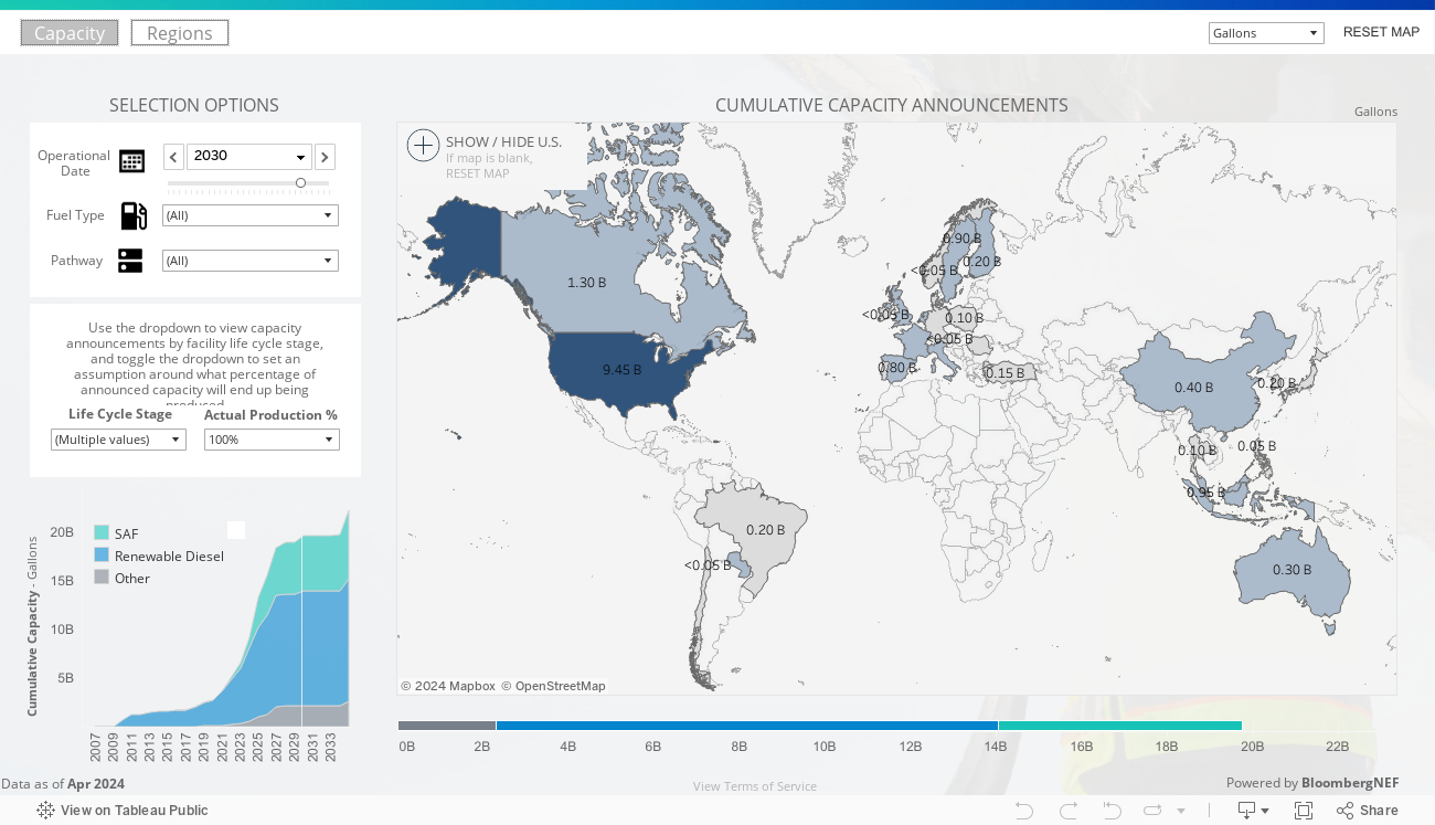
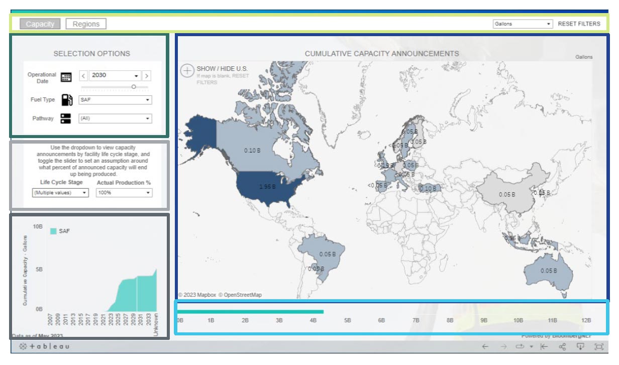
Commercial aviation’s journey to net zero will be critically dependent on scaling sustainable aviation fuel (SAF). Explore the global capacity of SAF with the SAF Dashboard.

The SAF Dashboard is a data visualization tool that provides an estimate of worldwide publicly announced SAF production capacity. By allowing the user to drill into SAF capacity by pathway, country and operational date, we are putting data first in pursuit of a world with more SAF.

Having issues viewing the SAF Dashboard? Please enable 3rd party cookies in your web browser.

Please view this experience on your desktop or laptop device.

How to Navigate the Dashboard: Capacity Tab

By Location

Click on country to filter the dashboard, or select multiple countries by clicking and dragging.

To move the map, click and hold for a few seconds, then drag the mouse.

To see a more detailed view of the U.S., click the plus-sign next to “Show/Hide U.S.”

Snapshot

Shows the cumulative announced production for the Operational Date selected.

Controls

Click on the buttons to move between pages. Toggle between Units of Measurement and click RESET MAP to remove any map selections.

Selection Options

Alter the selection options to see how announced fuel production changes based on the filters.

Operational Date: Move the slider from left to right or select the drop down.
Fuel type: Select SAF, Renewable Diesel (RD), or Other.
Pathway: Select the desired options from the dropdown and click ‘Apply’.

Total Capacity

Use the dropdown to view capacity announcements by facility life cycle stage, and toggle the dropdown to set an assumption around what percentage of announced capacity will end up being produced.

Over Time

Shows cumulative announced production over time. The vertical white line shifts to indicate the Operational Date selected.

How to Navigate the Dashboard: Regions Tab

SAF vs. Jet Fuel Consumption Map

Shows the percentage of SAF being used relative to total jet fuel consumption. Percentages will change based on the year selected. Changing the year on this screen has no impact to the settings on the Capacity page.

Zoom In or Out: Use the scroll wheel on the tracking device.

Move map: To move the map in the display area hold the left mouse key for a few seconds and then while continuing to hold move the tracking device. Alternatively, hold the ‘shift’ key and left mouse button to do the same (no need to wait a few seconds).

Deselect: Click on an ocean.

Production Capacity

Displays the announced production based on the region selected in the map on the left.

Frequently Asked Questions

What is the SAF Dashboard?

The SAF Dashboard is a data visualization tool that provides an estimate of worldwide publicly announced SAF production capacity. By allowing the user to explore SAF capacity by pathway, country and operational date, we are putting data first in pursuit of a world with more SAF.

Why did Boeing develop the SAF Dashboard?

To support the commercial aviation industry in its collective efforts to scale SAF and ultimately decarbonize, Boeing created the SAF Dashboard.

Through education and awareness of the disparity between SAF capacity and aviation needs via visual tools, the Dashboard aims to support policy conversations and catalyze necessary actions to close the gap to jet fuel demand.

Where does the data come from?

The data is provided by BloombergNEF and is updated quarterly.

How does Capacity differ from Actual Production?

Capacity reflects the amount a plant can produce, whereas actual production reflects the total amount actually produced. Full capacity is assigned to the plant in the year it comes online, but some plants may not ramp up to full production immediately, or may not fulfill total capacity. Note that the values in this dashboard reflect announced capacity, and not actual production for the year.

Is all of the capacity announced guaranteed to become available?

An announcement of capacity isn’t a guarantee that the capacity will become available, or that the facility will produce at the capacity announced. Facilities are in varying stages of development, and their status may evolve over time. If projects are abandoned or are put on pause, they drop off the map. In addition, note that even Operational facilities may not end up producing SAF at the full capacity announced. A number of factors, including when in the year the facility starts producing, what the product splits are, etc. influence the amount of actual production. The user can use the “Actual Production %” dropdown to set an assumption about the percent of capacity that will end up being produced.

How is the split between SAF, Renewable Diesel, and Other determined?

The chemical processes that result in SAF also tend to create a variety of co-products. Each producer makes individual choices on the relative mix of SAF, renewable diesel, and other products based on the specific feedstock used, chemistry of the production process, and on the economics of the design of the individual refinery. Any announced fuel mix details are logged as such. For projects that do not provide details of their output, a default is assigned based on the technology utilized. If projects stress their focus on SAF production, a Max-jet output profile is applied.

Go deeper into the details of the SAF Dashboard in our expanded FAQ.

Have questions?
Please contact [email protected].